Whether you're writing an RFC, prepping for a system-design interview, or documenting a platform, the hard part isn't drawing the boxes - it's showing how data moves under load. Markdy models the building blocks of a distributed system and animates the write path and read path so the trade-offs are obvious.
The building blocks are node kinds
- Compute:
service,api,worker,function,gateway - Data:
database,cache,bucket,search,warehouse - Messaging:
queue,topic,stream,broker - Distributed:
replica,shard,leader,follower
Example: a write that fans out
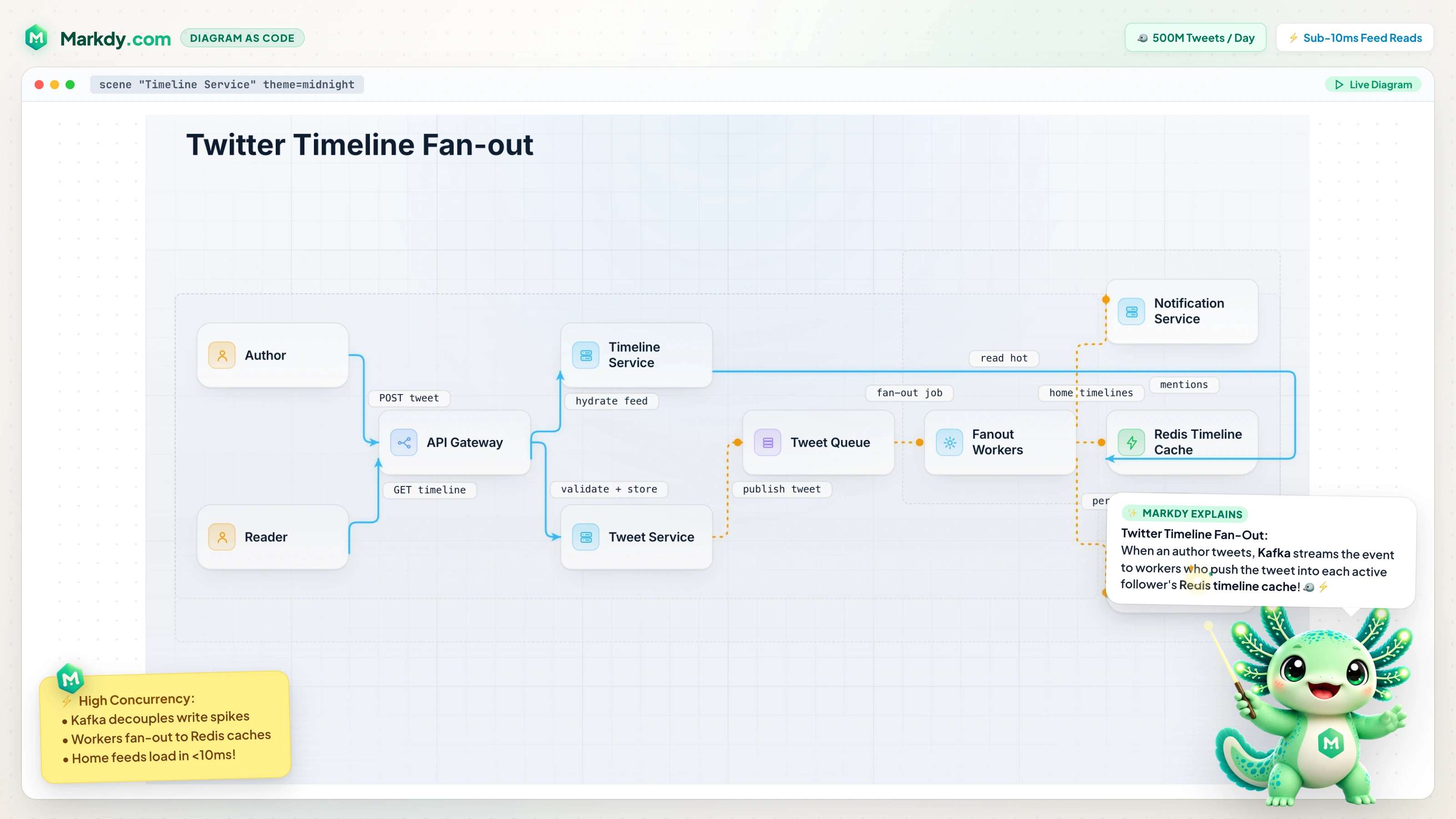
scene theme=paper
layout LR

client Mobile
gateway Gateway "API Gateway"
service Writes "Write Service"
queue Fanout "fanout.jobs"
worker Worker "Fan-out Worker"
cache Timeline "Timeline Cache"
database Store "Tweet Store"

group storage: Timeline Store

beat topology:
  show $nodes stagger=60ms

beat write:
  Mobile -> Gateway "POST /tweet" -> Writes
  Writes -> Store "persist" & Writes ~> Fanout "enqueue"
  Fanout ~> Worker "consume"
  Worker -> Timeline "push to followers"

beat read:
  Mobile -> Gateway "GET /timeline" -> Timeline "cache hit"

beat highlight:
  glow storage color=#22c55e
The animation makes the design legible: the synchronous write persists and emits a fan-out event; a worker consumes it and warms the timeline cache; reads then hit the cache. That's the story a static picture can't tell.
Keep architecture topology on the default ranked layout, or choose type=tree for ownership hierarchies, type=state for lifecycle transitions, or type=constellation for a radial platform map. The editorial theme is useful for RFCs; nebula makes a focal system stand out in an explainer.
Show the trade-off, then the takeaway
Split phases into beats so you can narrate write-path vs. read-path separately, and end with a glowor focus on the component that matters - the cache, the leader, the queue. It's the samediagram-as-code workflow, so the diagram is reviewable in a PR and easy for an AI agent to draft from a prompt.
Related
Running on Kubernetes? See animated Kubernetes architecture diagrams. Explaining call order? See animated sequence diagrams. Or open the example above in the playground.