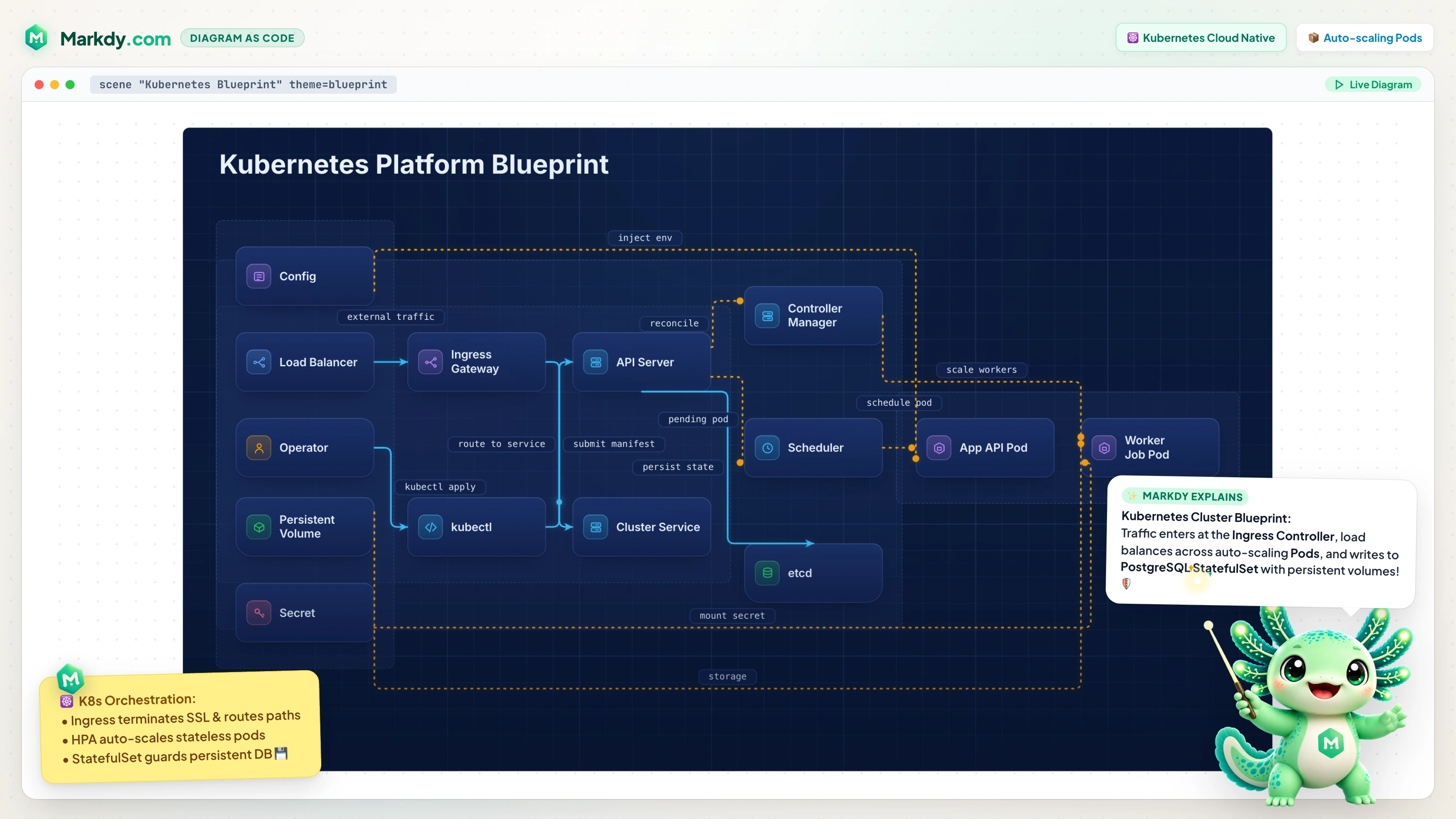
Explaining a Kubernetes cluster with a static diagram usually means a wall of boxes nobody reads. Markdy ships a first-class Kubernetes vocabulary, so you can describe the cluster in plain text and animate how a request actually travels through it.
Kubernetes node kinds
These are built into the language - no plugins, no icon packs to manage:
cluster,namespace,nodeingress,service,load_balancer,gatewaypod,deployment,replicaset,statefulset,daemonsetconfigmap,pvc,sidecar,service_mesh- Aliases like
k8s→clusterandlb→load_balancer
An animated cluster request path
scene theme=paper
layout LR

client User
load_balancer LB "Cloud LB"
ingress Ingress "NGINX Ingress"
service Svc "orders Service"
pod PodA "orders pod 1"
pod PodB "orders pod 2"
database DB "Postgres"

group pods: PodA PodB

beat topology:
  show $nodes stagger=60ms

beat request:
  User -> LB "HTTPS" -> Ingress "route /orders" -> Svc
  Svc -> PodA "load-balanced" & Svc -> PodB "load-balanced"
  PodA -> DB "query"

beat highlight:
  glow pods color=#38bdf8
Reveal the topology first, then play the hop from load balancer to ingress to service to pods to the database. Because the layout and edge routing are automatic, adding a pod or a sidecar is a one-line change - perfect for keeping the diagram accurate as the manifests evolve.
Great for runbooks, RFCs, and talks
Drop the scene into your Astro or MDX docs so the cluster diagram lives next to the manifests and updates in the same PR - realdiagrams as code. For a broader systems example, seeanimated system design diagrams, or open this one in theplayground and tweak it.